


Last edited by alfredo.astort; 06-29-2015 at 12:19 PM.

Really interesting indeed! It made me think of an article I read the other day that stated that one language dies every 14 days:
One Language Disappears Every 14 Days, New York City Plays an Unforeseen Role | Manhattan, New York, NY | News
Wow, this is really very interesting, because it´s very graphic and you can have a very good picture on how languages are distributed, and the subgroups within each language. Thank you Alfredo for sharing this.
It´s surprsing to see how Japanese, only showing Japan as its main region, and being so small greographically speaking, can represent a considerable part of the total...mmm

Les dejo este post de alfredo.astort muy insteresante!
Interactive map about european languages evolution
Oops, I´ve just found this thread here... Yesterday I posted this link showing the world´s most spoken languages... Here it goes again:
it should be one of the last posts
Los 9 idiomas más fáciles de aprender para hispanoparlantes
me encanto la infografia!!
Hola Dani
sí, me pareció interesante y además, al ser tan gráfico me resulta más fácil de ver las proporciones a nivel general

Is there any criterion for how much knowledge is enough to be counted as language speaker in this Infographic ?
Hi Anabella
I took a look again, and the first paragraph at the top says the map provides the numbers of native speakers for each language, in millions...Is that what what you are asking?
There are currently 1 users browsing this thread. (0 members and 1 guests)
 Posting Permissions

 LinkBack URL
 About LinkBacks
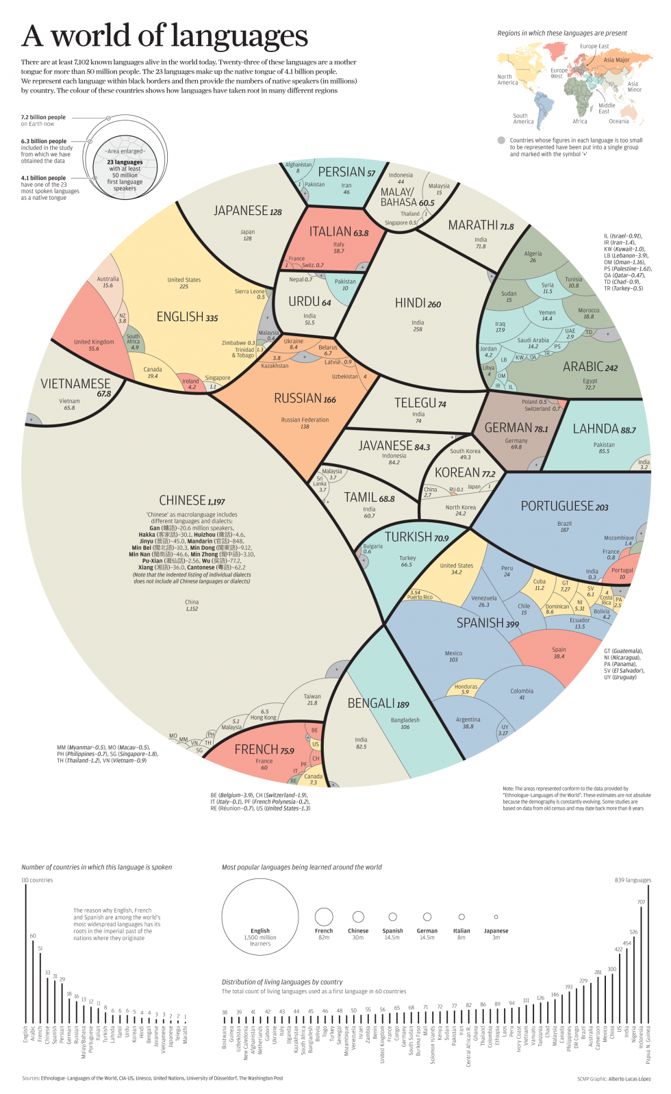


 Reply With Quote